Favicon Best Practices
Learn best practices for creating effective favicons that work well across all platforms and browsers. Design guidelines, technical recommendations, and common mistakes to avoid.
Design Guidelines
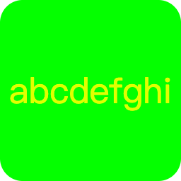
Text Length
Single characters work best. Favicons are displayed at very small sizes (16×16 to 32×32 pixels), so one or two characters are most readable. Longer text becomes illegible and cluttered.
Font Selection
Choose fonts that remain legible at small sizes:
- Bold fonts: Work better than thin or light weights
- Sans-serif fonts: Generally more readable at small sizes
- Avoid decorative or script fonts that become unreadable when scaled down
- Test visibility: Always preview your favicon at actual size (16×16 pixels) before finalizing
Color Contrast
Use high contrast between text and background colors. Favicons appear on various browser backgrounds (light, dark, colored), so ensure your design is visible in all contexts. Avoid similar colors that blend together at small sizes.
Simplicity
Keep designs simple and uncluttered. Complex details disappear at small sizes. Focus on a single, clear visual element that represents your brand or website effectively.

Good examples: Simple, high-contrast favicons
Avoid: Overly complex or low-contrast designs
Technical Recommendations
Format Selection
SVG (Scalable Vector Graphics): Best for modern browsers. Resolution-independent and looks crisp at any size. Recommended for high-quality favicons.
PNG: Widely supported format with transparency support. Use for various sizes (16×16, 32×32, 48×48, 96×96, 180×180, 192×192, 512×512).
ICO: Traditional format with broad browser support. Include for maximum compatibility, especially for older browsers.
Size Requirements
Provide favicons in multiple sizes to ensure optimal display across all devices and contexts:
- 16×16 pixels: Standard browser tab size
- 32×32 pixels: High-DPI displays and some browser contexts
- 180×180 pixels: Apple touch icon for iOS home screens
- 192×192 and 512×512 pixels: Android home screen icons and PWA support
Note: Always design at the largest size (512×512) and scale down, rather than scaling up from smaller sizes. This ensures the best quality at all sizes.
Browser Compatibility
Test your favicon across different browsers (Chrome, Firefox, Safari, Edge) and devices (desktop, mobile, tablet). Each browser may handle favicons slightly differently, so comprehensive testing ensures consistent appearance.
Common Mistakes to Avoid
Using Full Logos
Avoid using your full company logo unless it's extremely simple. Most logos contain too much detail to be recognizable at 16×16 pixels. Instead, use a simplified version, monogram, or key symbol from your brand.
Low Contrast Designs
Designs with low contrast between elements become invisible at small sizes. Always ensure sufficient contrast for visibility across different browser themes and backgrounds.
Incorrect File Placement
Ensure favicon files are placed in the correct directory (usually public or static) and that HTML link tags reference the correct paths.
Missing Sizes
Providing only one favicon size limits compatibility. Always include multiple sizes (16×16, 32×32, 180×180, 192×192, 512×512) to ensure proper display across all devices and contexts.
Not Testing
Always test your favicon in multiple browsers and devices before deploying. What looks good in one browser may not display correctly in another. Use browser developer tools to verify favicon loading.
Brand Consistency
Your favicon should be consistent with your overall brand identity:
- Use your brand colors to maintain visual consistency
- Incorporate recognizable elements from your logo or brand identity
- Ensure the favicon reflects your brand's personality and style
- Maintain consistency across all touchpoints (website, social media, mobile apps)
Conclusion
Creating an effective favicon requires balancing design simplicity with technical requirements. By following these best practices—keeping designs simple, using high contrast, providing multiple sizes, and testing across browsers—you can create a favicon that enhances your website's branding and user experience.
Remember: a well-designed favicon is a small detail that makes a big difference in how users perceive and interact with your website.